Serene Mobile App
Mobile App - Reaching serenity
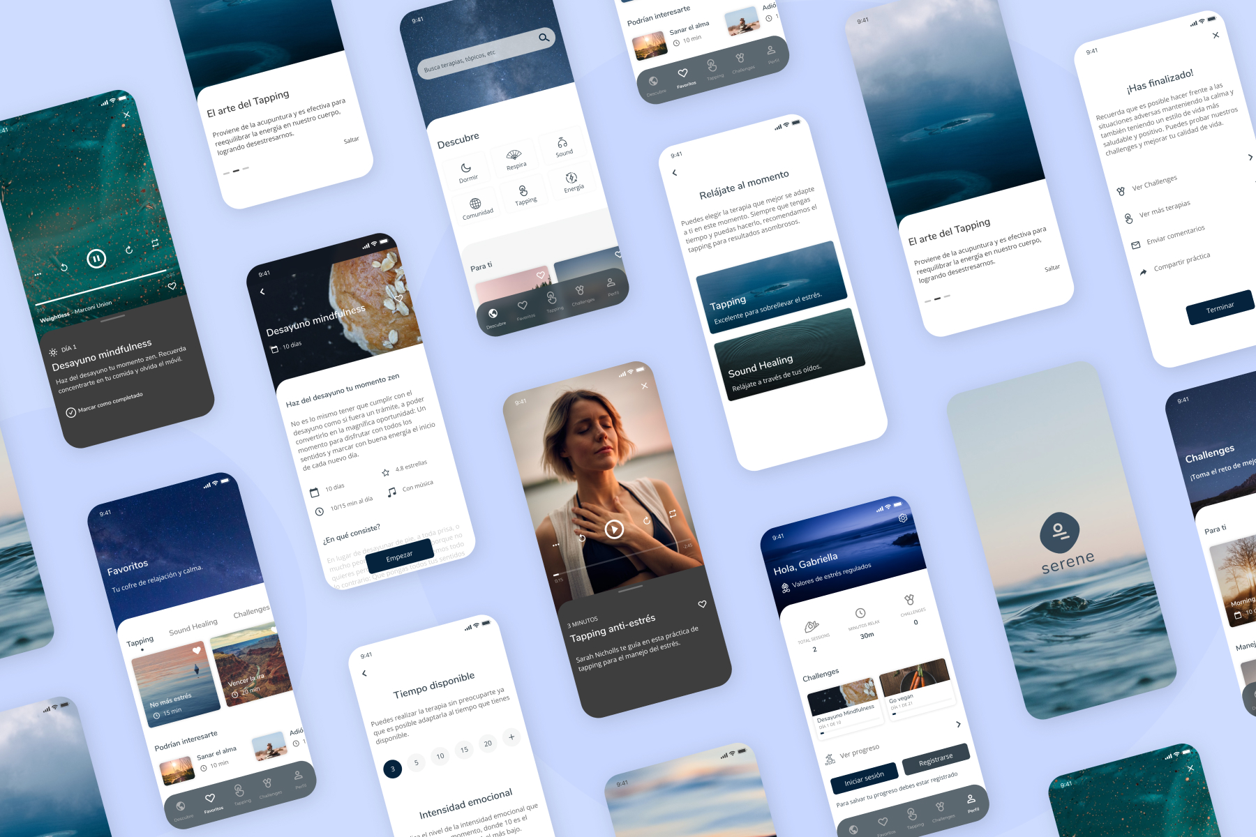

We all know that we live in a frenetic world, with a fast pace of life, and also we all face stressful situations throughout our lives. It is something that we have to learn how to deal with, but do we know how to control ourselves? Do we know how to manage stress? Are we capable of controlling it?
About the App
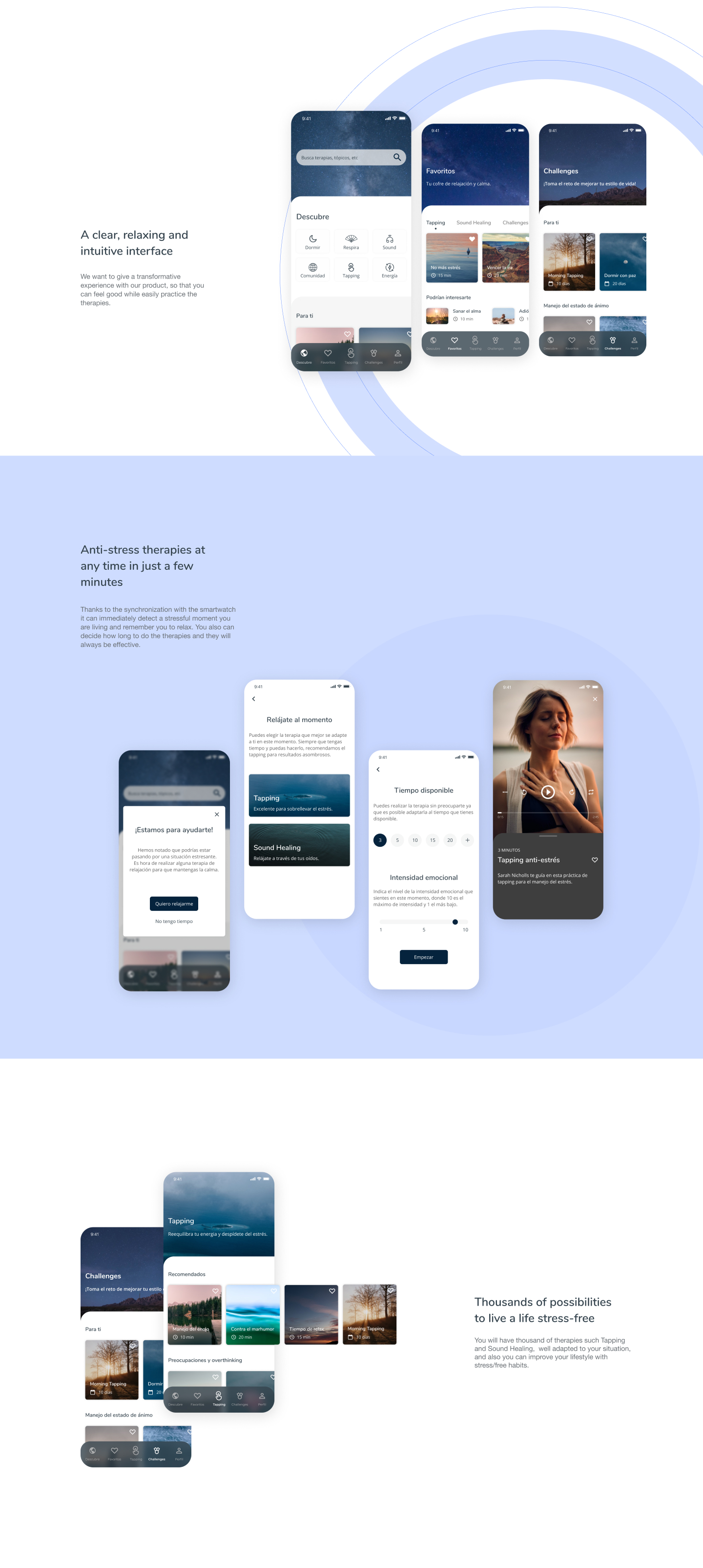
Serene is a mobile app that helps users to reach serenity and peace, living a life stress-free using alternaties therapies, such as Tapping and Sound Healing, favoring stress management and control of negative responses to adverse situations at any time and in an effective way.
The challenge
Stress is a very wide concept and it is one of the biggest problems in our society. Focusing on that, I carried out a project in which I had the challenge of improving the experience of people who suffer stress through alternative therapies, applying Design Thinking methodology.
The process
To the development of Serene App, I followed the Design Thinking Methodology: Emphatize, Decide, Ideate, Prototype and Test. As part of any project, research is essential, so I started documenting myself.
- UX Research: Research Questions, Desk Research, Benchmarking, users and expert interview, surveys
- Humanizing the project: Persona, User Journey, Scenarios
- Detection of Insights, Point of View, HMW, Value Proposition and prioritization of ideas (MoSCoW)
- Storyboard and Conceptual Moodboard
- UI Development: Style Guide and Prototyping
- Visual Identity
- User Test and iteration
“I wish I had had a tool that would have helped me to deal with difficult situations. Since I was little I have suffered from stress.”
User Persona
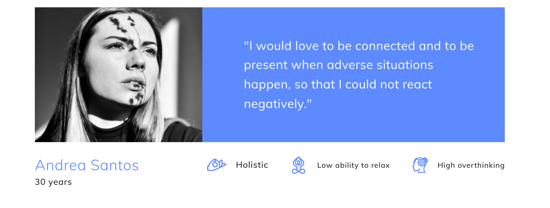
Andrea is my persona. She has an affinity for holistic aspects and get easily stressed, as well as the habit of overthinking and difficult to get relaxed. She accompanied me throughout the entire product development process.
User flow
I defined the steps that I had to take to achieve a specific objective and thus have a clearer vision.

Conceptual Moodboard
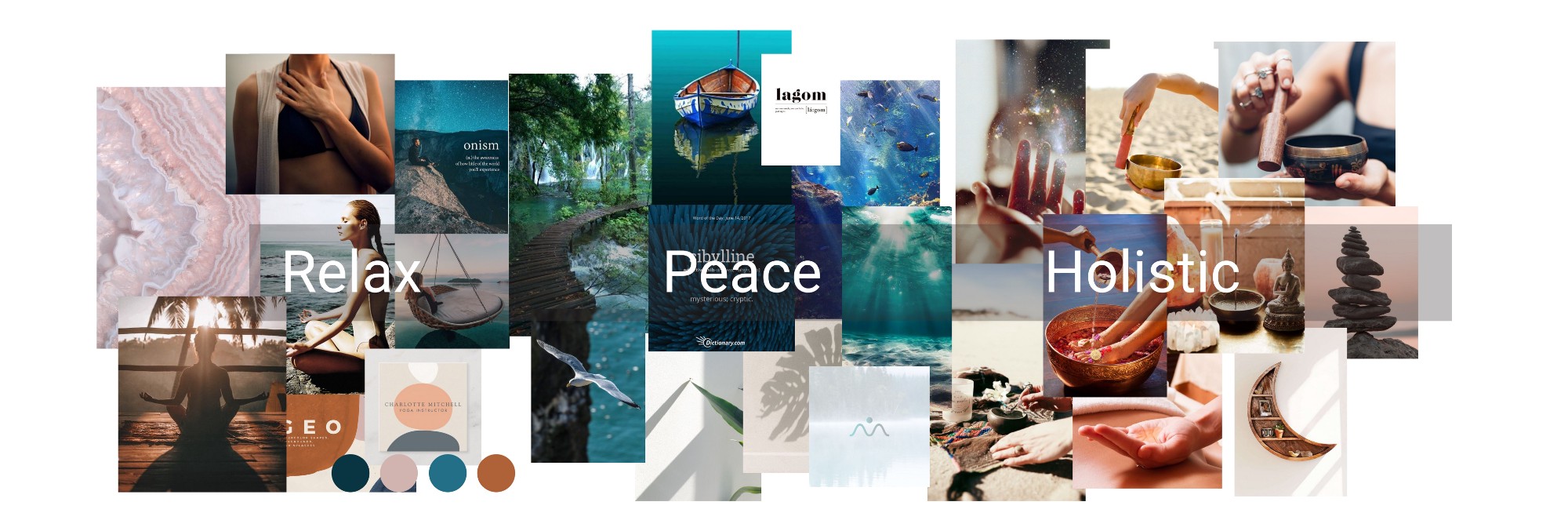
I made a conceptual moodboard with the concepts of peace, relaxation, and holistic being these three elements that would guide a graphic representation of everything previously investigated, looking to find empathy and connection with users.
Serene is the name of this App. From Latin serenus its meaning is “clear, calm, peaceful”. Giving it a positive conception and understanding the state of serenity when you are stress-free.
Style Guide
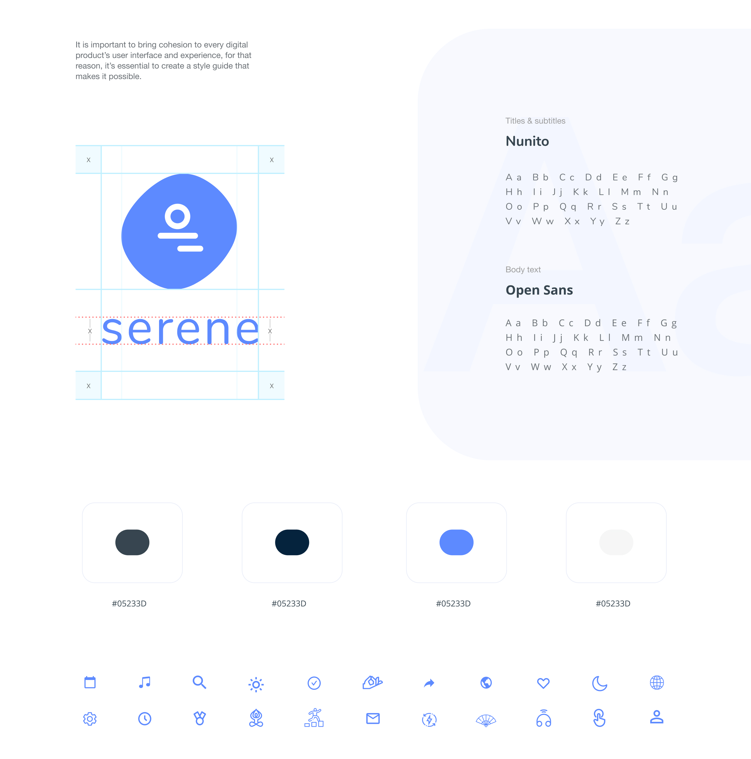
Following the same ideal, the logo represents the stones that symbolize the balance and harmony of being in serenity, away from stress.About the colors, I wanted to play with the deep blue tones. Stressful situations are able to alter the heart rate, and using the blue color it is possible to attenuate it.
Wireframes
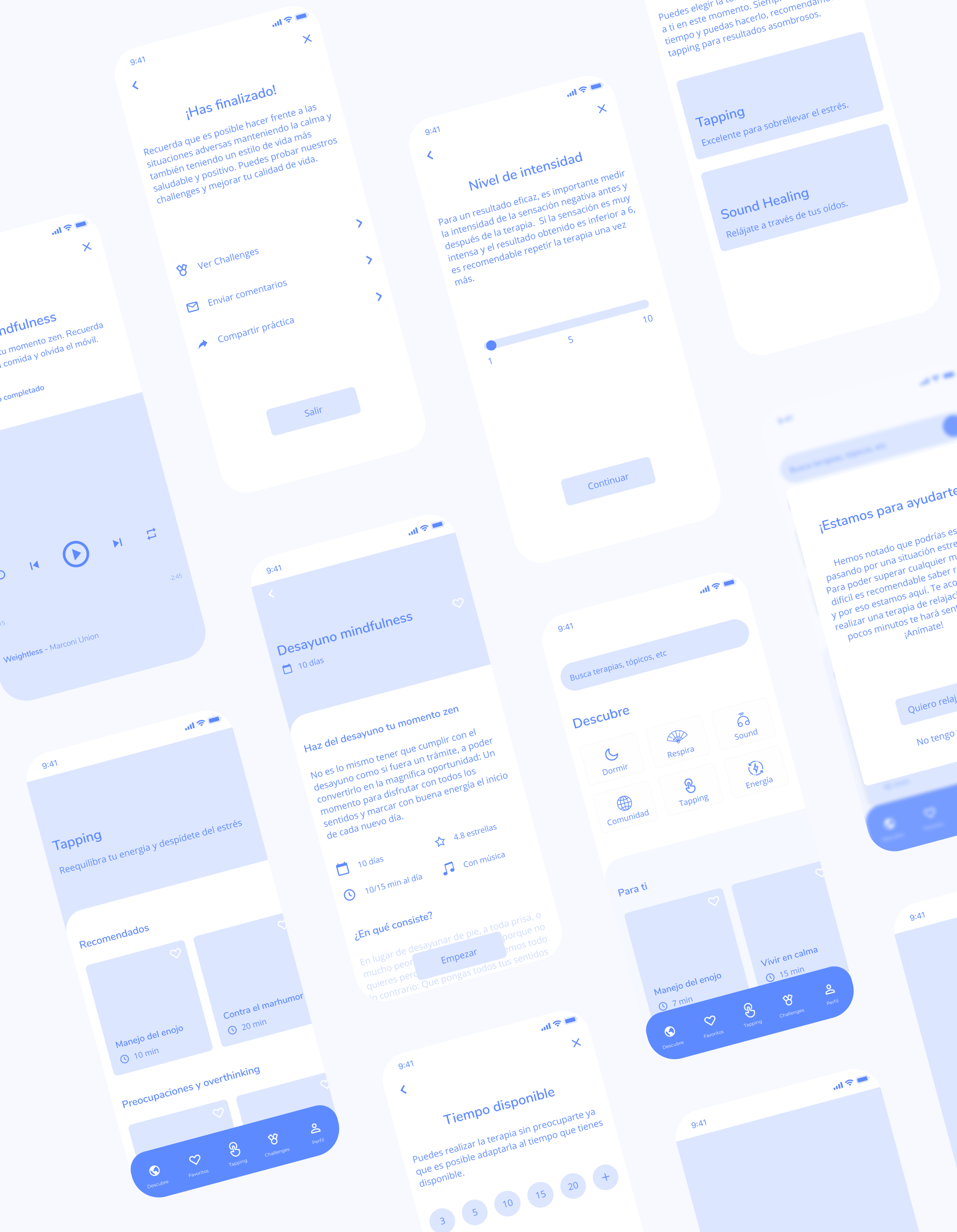
The time has come to create the structure of the App in digital. In this way, it could be checked if it fulfilled the requirements. After this, I made the wireflows to determine the effectiveness of the structure flow.
Prototype
Click below for full research :)
Key takeaways
- UX Research is a fundamental part of any project. To have an effective product, there must be strong and accurate research behind it.
- Testing the product allowed me to observe details and things that I had not noticed before. Each product has to satisfy the user’s needs, so that it is important to hear them.
- Compromise is essential to carry out any project.
